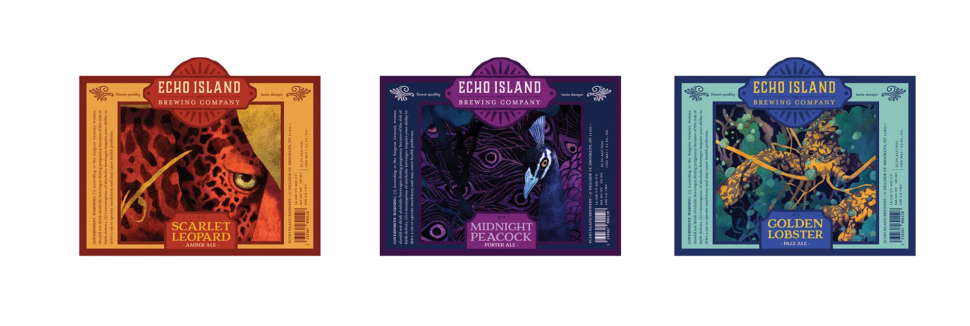
Echo Island Brewing Co.
Team:TJ Freda
Art Direction, Branding, Illustration, Strategy, Copywriting, Packaging, Motion Graphics, Brand Proposal
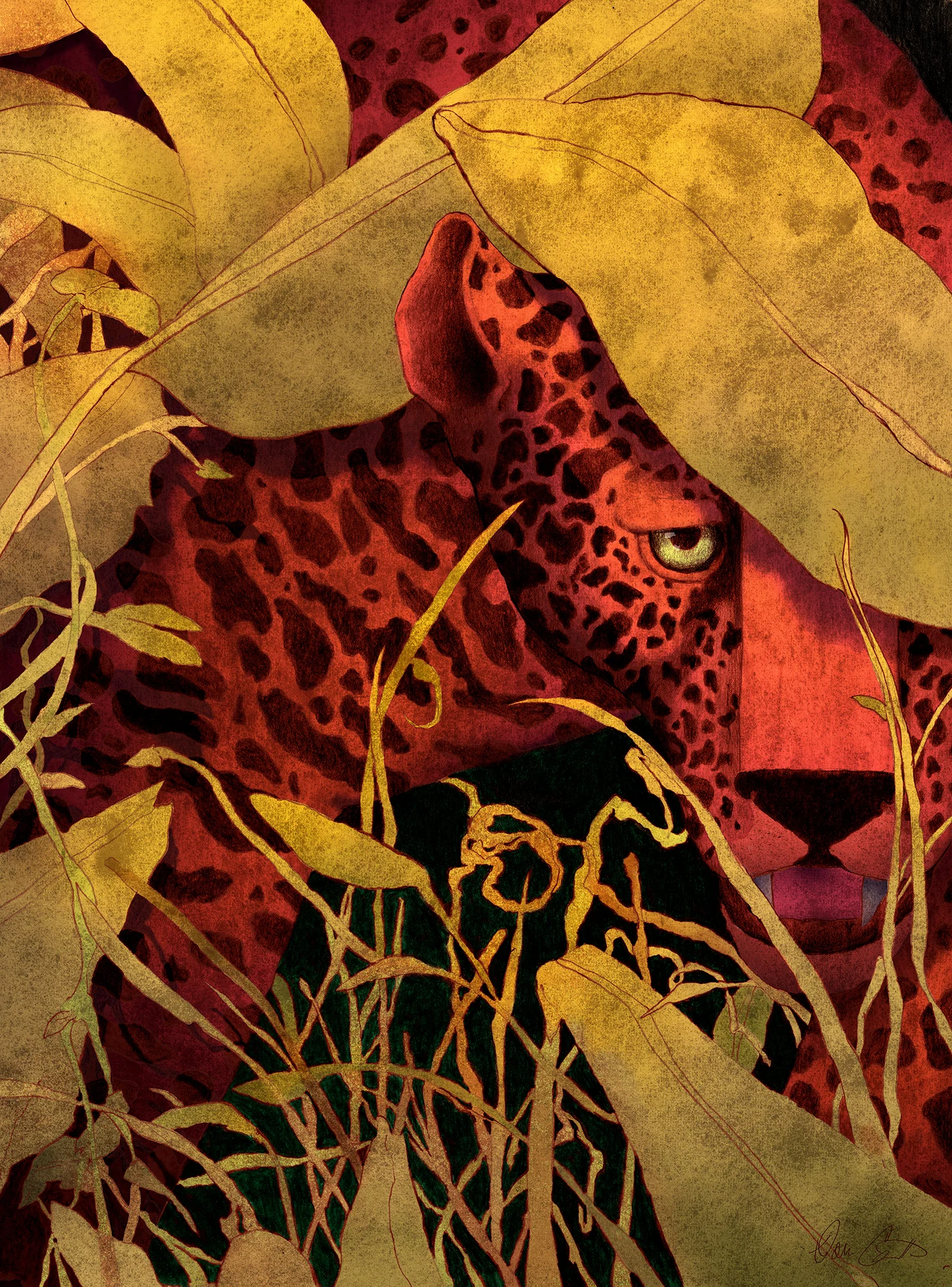
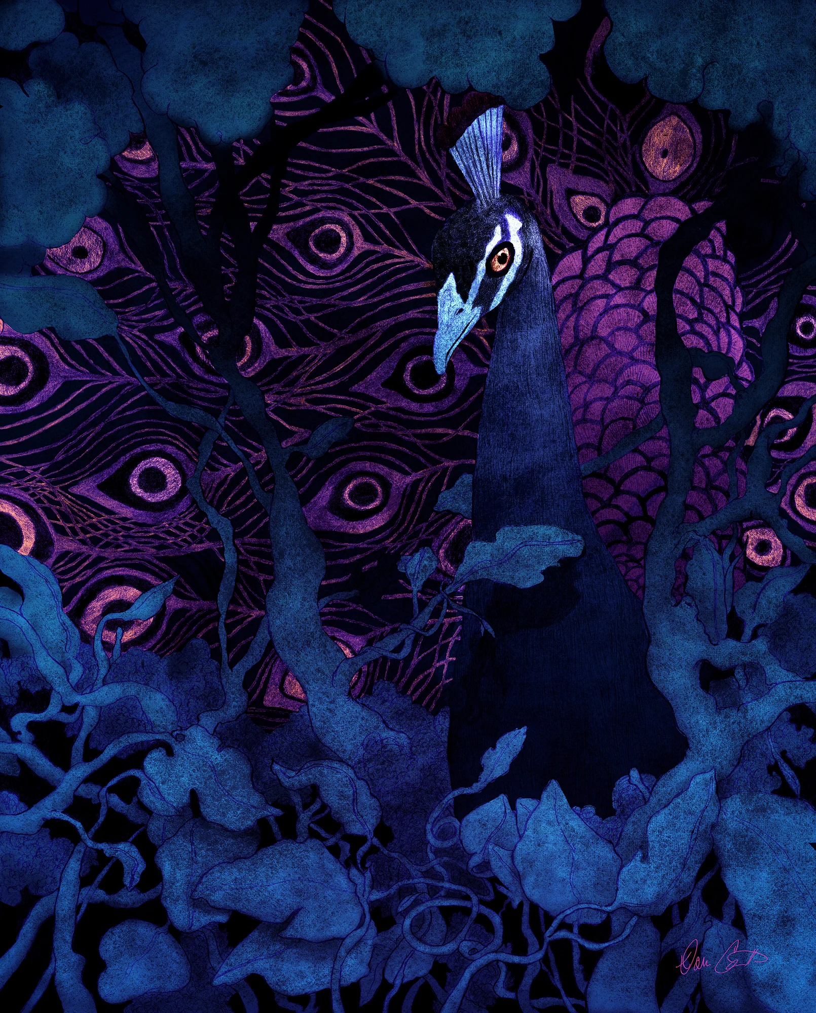
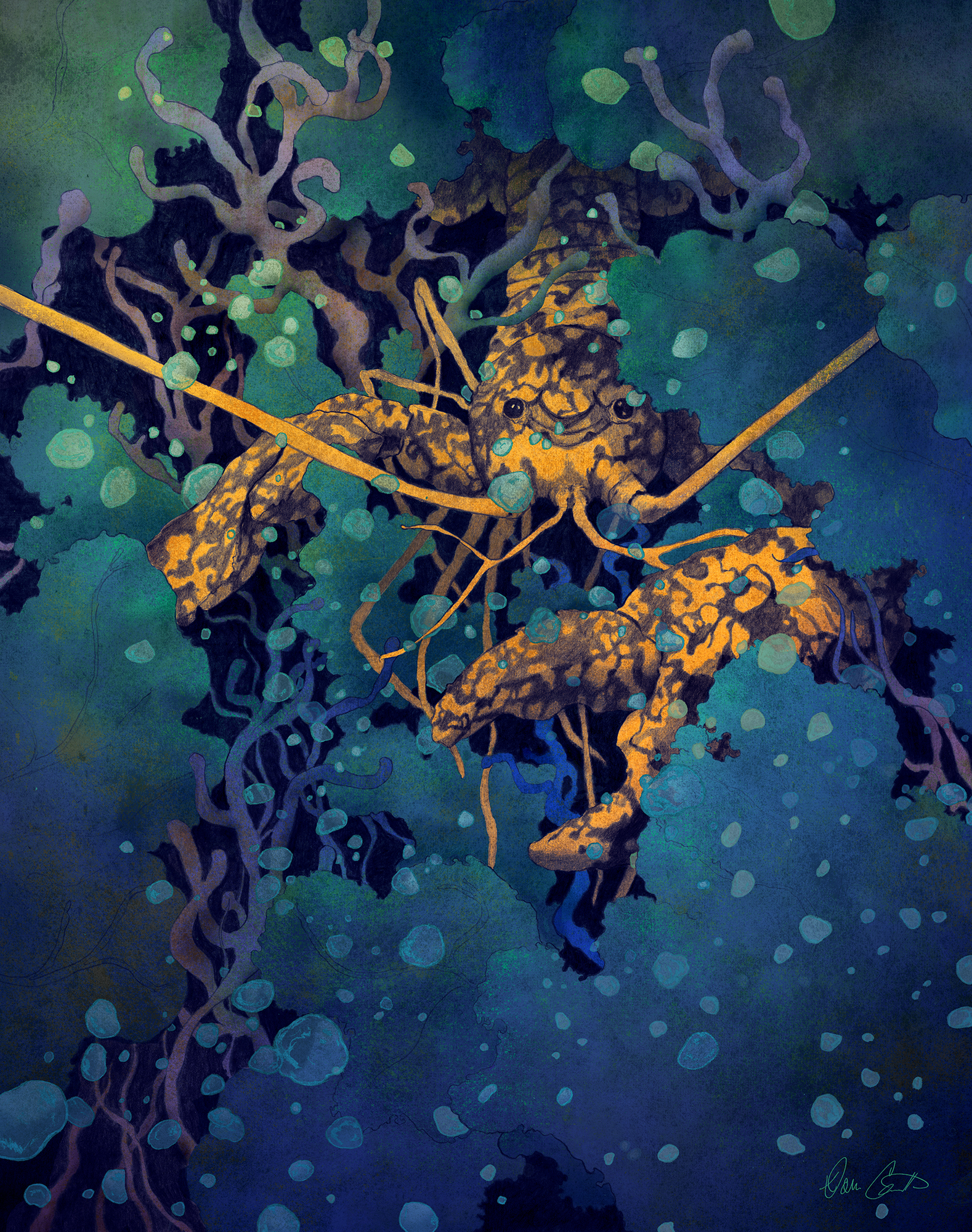
Echo Island is a far off distant place full of strange colored animals and other odd anomalies. During the day it is nothing short of a paradise, but when the sun fades over the horizon is when the strangeness begins.
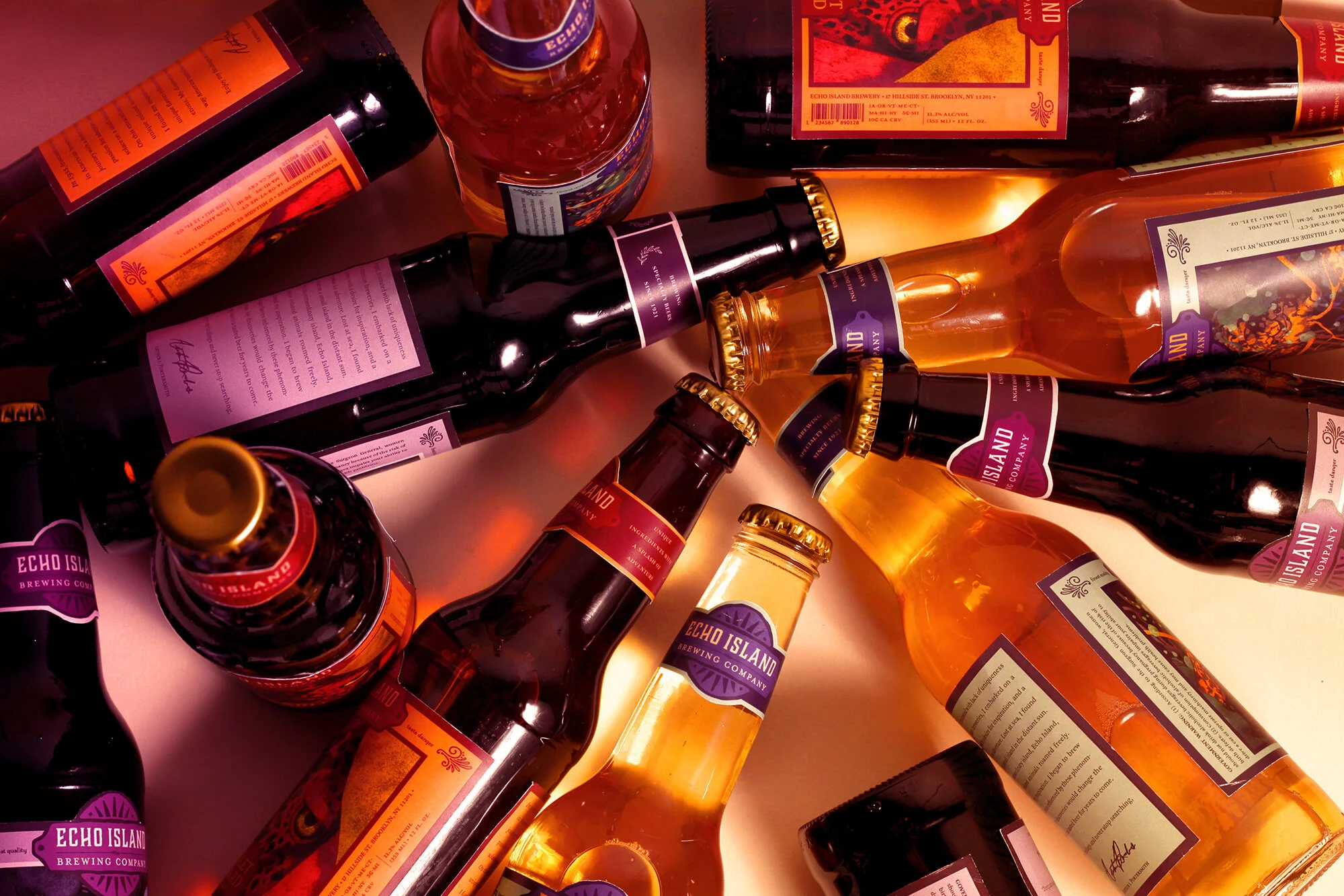
Packaging
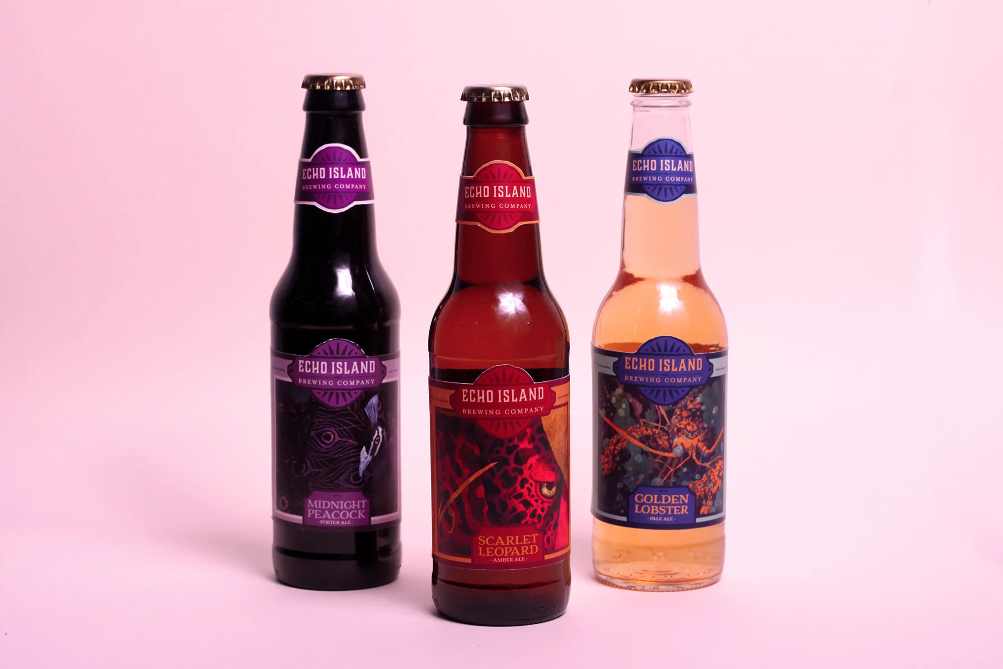
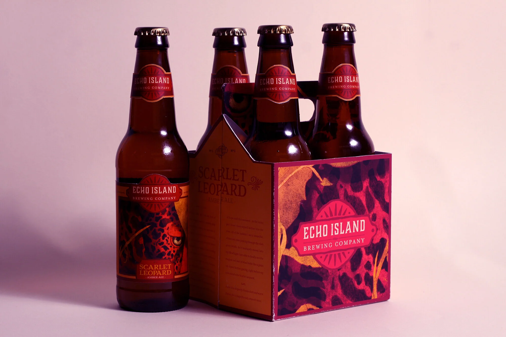
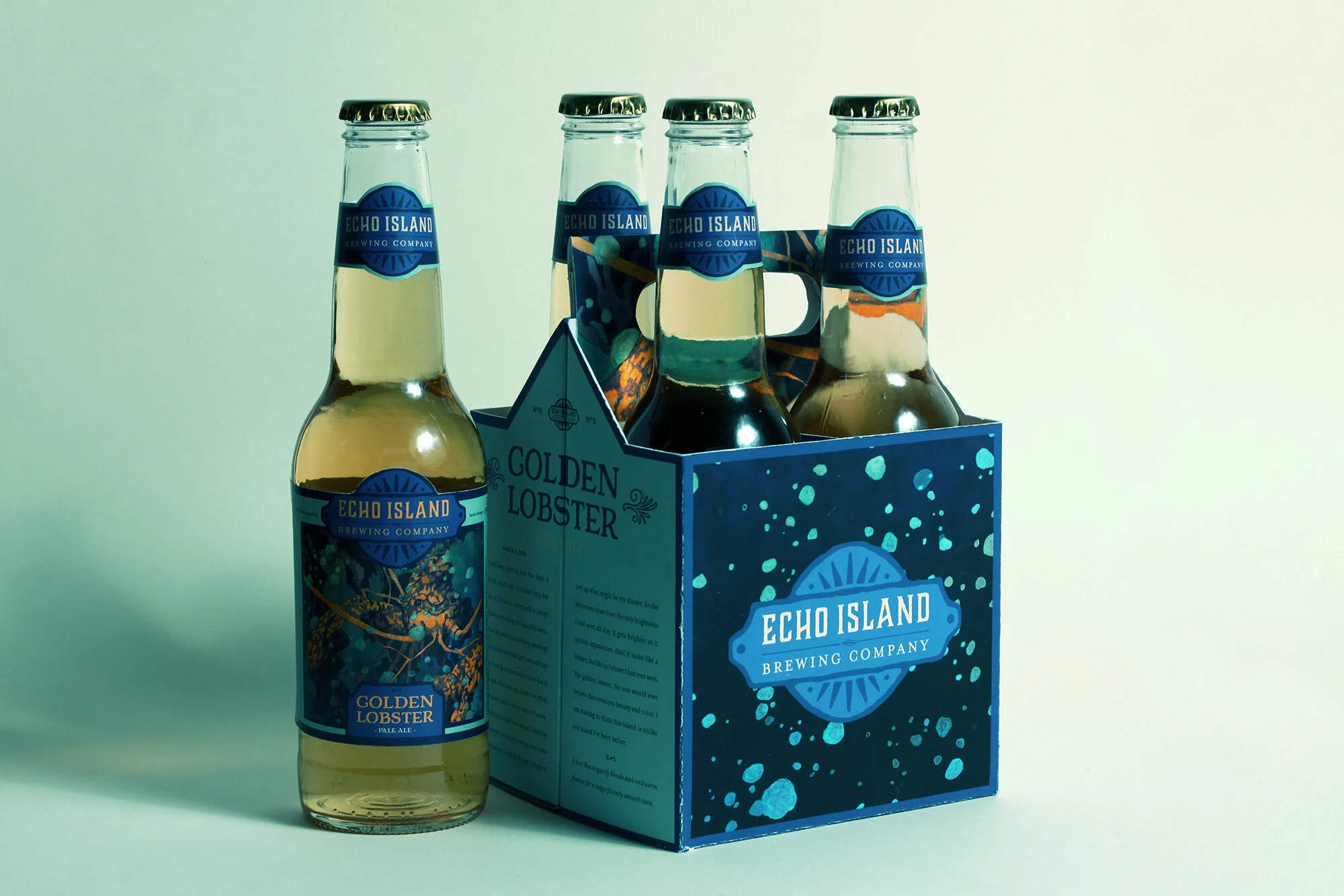
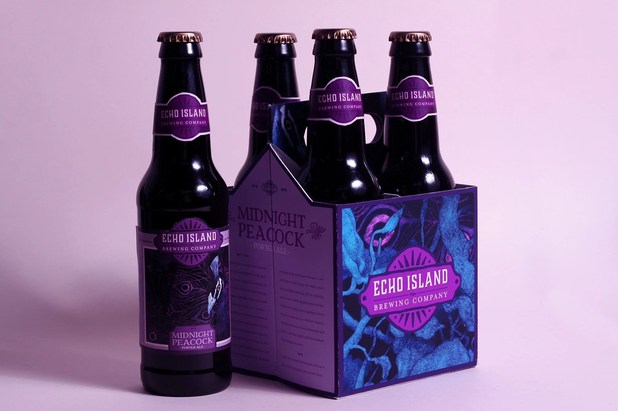
Echo Island provides three distinct types of craft beer, an amber, pale, and porter ale. Traditional packaging was designed for variety store sales and larger scale production, while the premium bottles of obscure sizes can be found direct from the brewery or through the special event service. Each ale has their own sub identity within the Echo Island brand. The receipt and flavors differs, but the visuals share a consistent mood as you get a brief glimpse at a rare anomaly.
Advertising & Copywriting
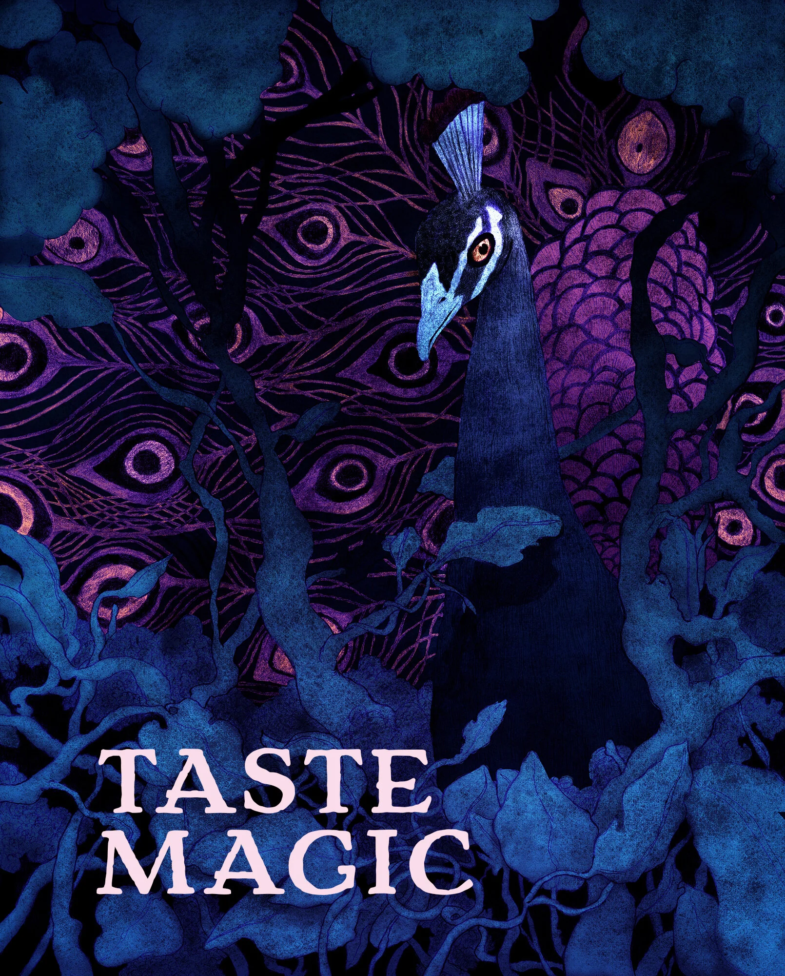
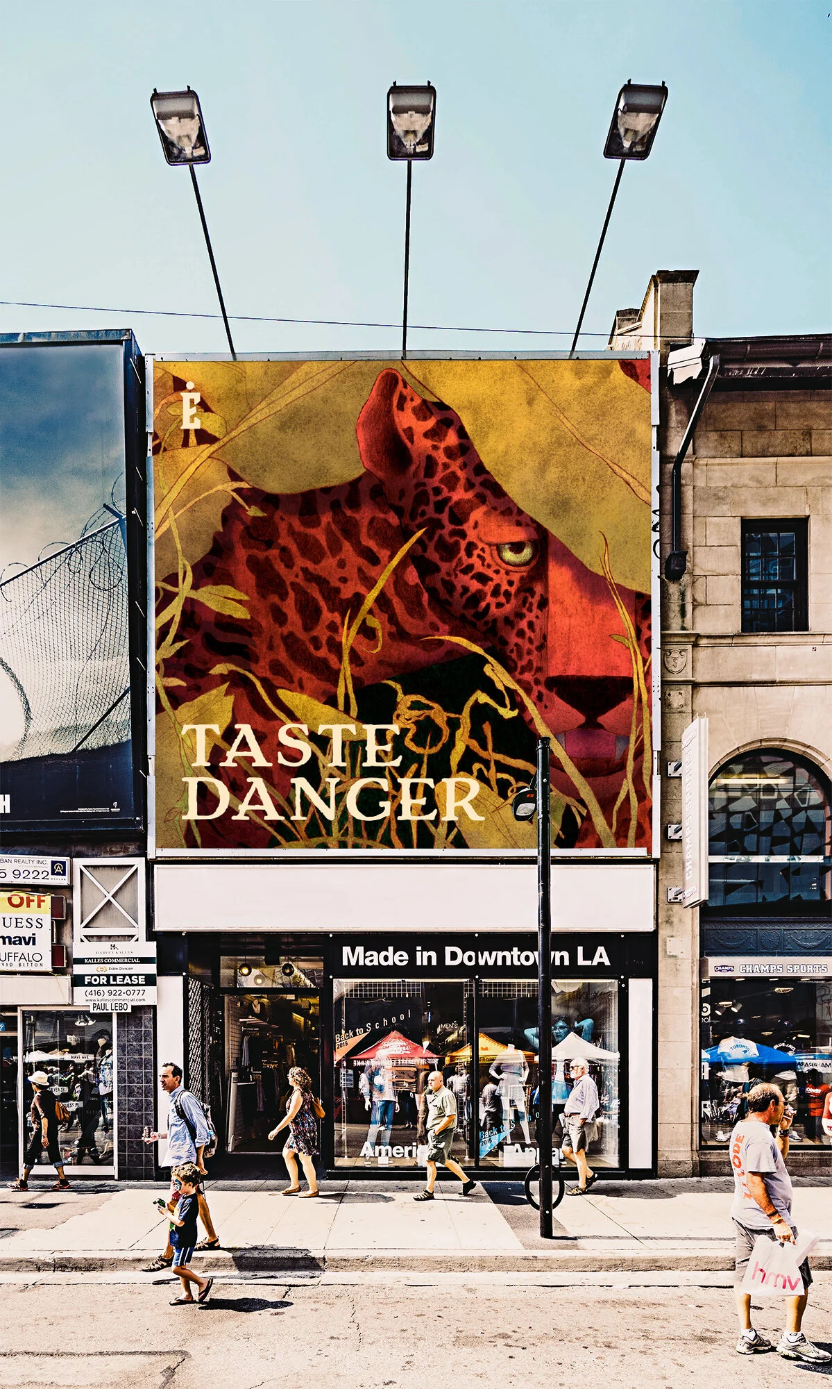
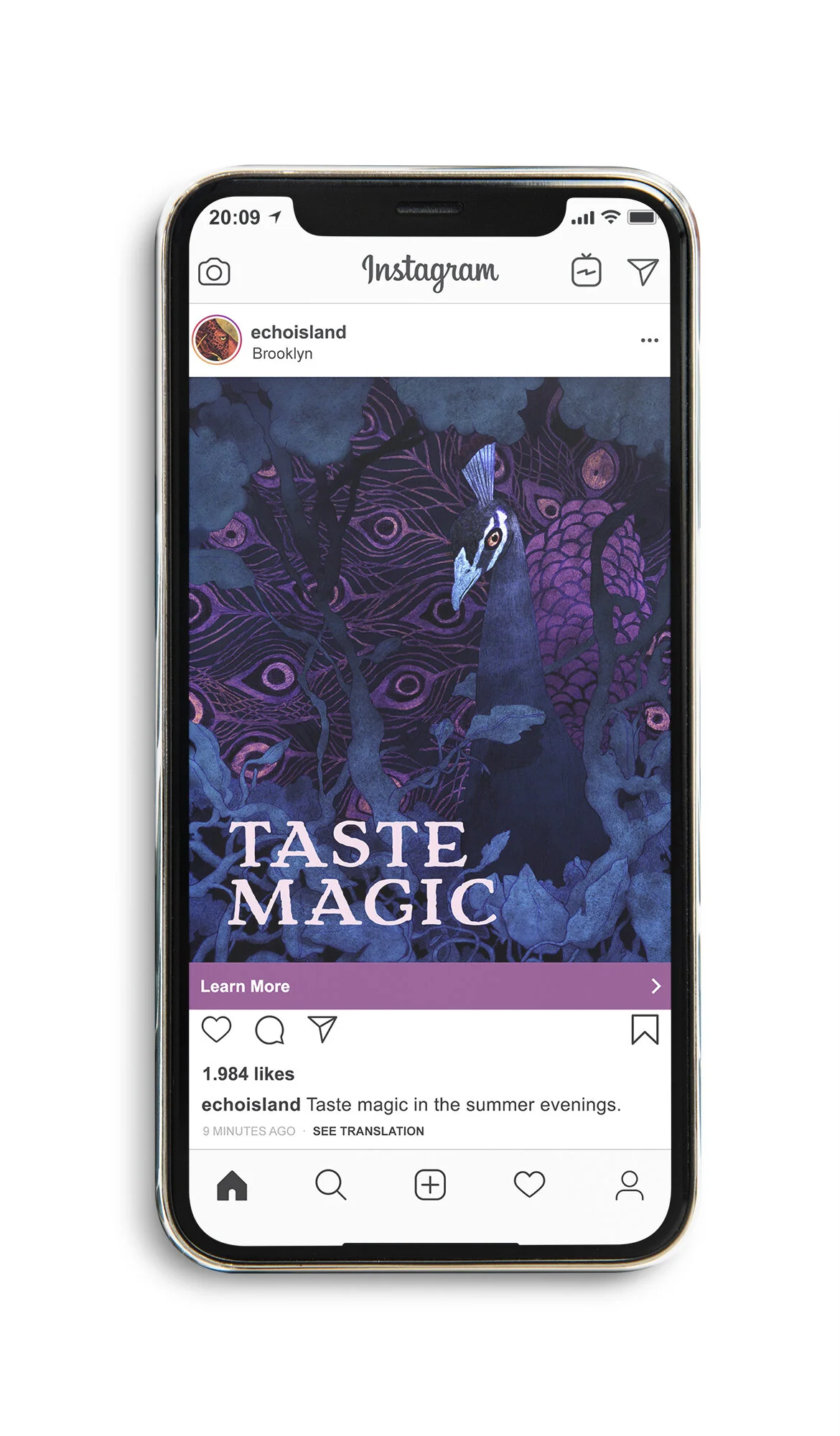
We used the three central illustrations as the focal point of a versatile digital and print advertisements campaign. They are recognizable, but obscure enough to be observed, spark curiosity, be remembered, and add beauty to part of an urban or digital landscape. This was an opportunity to use advertisements as an installation that people would want to look at, engage with, and keep, instead of something expected and unwanted. These ads aim to be mysterious while still peeking the interests by getting a glimpse of partial eye contact with the animals that express the story behind brand.


Illustration
Similar to other case studies, each illustration was designed to work in a modular system, so one image could be used in many different layouts, sizes, and shapes. This unconstrained format allows each illustration to be adapted easily to any form of print or digital. The Illustrations primary function was to be used for advertising and packaging, while still being able to adapt to other future merchandise or products. The three illustrations expand on the mystery and story of the Echo Island identity. We wanted to evoke the sense of mysterious, strange, and magical encounters an adventurer may encounter while exploring the island. These images are the central focus of the identity which many of the other brand discussions where based from, including color, mood, and story. All of the animals are based on really genetic anomalies found in each species.